CSS3 has introduced many new and exiting features to make your web application make more appealing. In this post i am going to demonstrate css3 gradient background effect. I just wanted to introduce it so that the demo created is compatible with firefox only. This demo is not supported in other browsers.
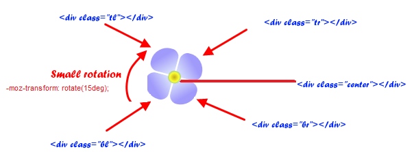
When i thought to explain css3 gradient background, first thing came in my mind was to create flowers and i went with it.Lets start with demo. First of all we will need 4 divs to create flower petals which will have css3 gradient background rotated at different angles.
If you like this css3 gradient background tutorial please share it.
When i thought to explain css3 gradient background, first thing came in my mind was to create flowers and i went with it.Lets start with demo. First of all we will need 4 divs to create flower petals which will have css3 gradient background rotated at different angles.
HTML layout for CSS3 gradient background
|
1 |
CSS3 gradient background and petal rotations
|
1 2 3 4 5 6 7 8 9 10 11 12 13 14 15 16 17 18 19 20 21 22 23 24 25 26 27 28 29 30 31 32 33 34 35 36 37 |
.flower{ -moz-transform: rotate(15deg); position: absolute; display: none; } .flower div{ width : 40%; height : 40%; margin : 1px; float : left; } .flower .center{ width: 20%; height: 20%; background: -moz-radial-gradient(#C0AB16, #FFFF33, #1E90FF); position: absolute; top: 32%; left:32%; border-radius: 50px; } .flower .tl{ background: -moz-linear-gradient(-45deg, #A09BFB 40%, #DBE2FB 90%) ; border-radius: 30px 15px 0px 15px; } .flower .tr{ background: -moz-linear-gradient(225deg, #A09BFB 40%, #DBE2FB 90%) ; border-radius: 15px 30px 15px 0px; } .flower .bl{ background: -moz-linear-gradient(45deg, #A09BFB 40%, #DBE2FB 90%) ; border-radius: 15px 0px 15px 30px; } .flower .br{ background: -moz-linear-gradient(135deg, #A09BFB 40%, #DBE2FB 90%) ; border-radius: 0px 15px 30px 15px; } |


can you give me code of CSS3 gradient background???
plz…it’s very nice…
All the css and html code is there in post as well as in demo.
[…] Tweet In our previous tutorials we have had look at different features of css3 and html5 like creating css3 flowers using gradient effect, Introduction to HTML5 web storage, Ajax file upload with drag and drop and progress bar. In this […]
Really useful and good tutorial
and thanks for demo like newbie like myself
Here the code for All Browser support & 100% working!!
Download jquery-1.7.1.min.js from here : http://blog.jquery.com/2011/11/21/jquery-1-7-1-released/
CSS3 Flowers
body {
margin: 0;
}
.container {
width: 100%;
max-width: 1002px;
margin: auto;
}
.flower{
-moz-transform: rotate(15deg);
position: absolute;
display: none;
}
.flower div{
width : 40%;
height : 40%;
margin : 1px;
float : left;
}
.flower .center{
width: 20%;
height: 20%;
background: #FFFF33;
background: -ms-radial-gradient(#C0AB16, #FFFF33, #1E90FF);
background: -moz-radial-gradient(#C0AB16, #FFFF33, #1E90FF);
background: -webkit-gradient(radial, center center, 0, center center, from(#C0AB16), to(#1E90FF));
position: absolute;
top: 32%;
left:32%;
border-radius: 50px;
}
.flower .tl{
background: #A09BFB;
background: -ms-linear-gradient(top, #A09BFB 40%, #DBE2FB 90%);
background: -webkit-gradient(linear, left top, left bottom, from(#A09BFB), to(#DBE2FB));
background: -moz-linear-gradient(-45deg, #A09BFB 40%, #DBE2FB 90%);
border-radius: 30px 15px 0px 15px;
}
.flower .tr{
background: #A09BFB;
background: -ms-linear-gradient(top, #A09BFB 40%, #DBE2FB 90%);
background: -webkit-gradient(linear, left top, left bottom, from(#A09BFB), to(#DBE2FB));
background: -moz-linear-gradient(225deg, #A09BFB 40%, #DBE2FB 90%);
border-radius: 15px 30px 15px 0px;
}
.flower .bl{
background: #A09BFB;
background: -ms-linear-gradient(bottom, #A09BFB 40%, #DBE2FB 90%);
background: -webkit-gradient(linear, left bottom, left top, from(#A09BFB), to(#DBE2FB));
background: -moz-linear-gradient(45deg, #A09BFB 40%, #DBE2FB 90%);
border-radius: 15px 0px 15px 30px;
}
.flower .br{
background: #A09BFB;
background: -ms-linear-gradient(bottom, #A09BFB 40%, #DBE2FB 90%);
background: -webkit-gradient(linear, left bottom, left top, from(#A09BFB), to(#DBE2FB));
background: -moz-linear-gradient(135deg, #A09BFB 40%, #DBE2FB 90%);
border-radius: 0px 15px 30px 15px;
}
All Browser support
<!—
Basic code to create single flower
–>
setTimeout(“addFlower()”, 2000);
function addFlower(){
var flower = ”;
var size = randomNum(40,100)+”px”;
$(flower).css(“left”,(Math.random()*95)+”%”).css(“top”,(Math.random()*95+”%”)).css(“height”,size).css(“width”,size).appendTo(‘body’).fadeIn(“slow”);
setTimeout(“addFlower()”, 1000);
}
function randomNum(pMin, pMax){
min = pMin pMin ? pMax : pMin;
var resultArr = [], randNumber;
randNumber = Math.round(min + Math.random() * (max – min));
if (resultArr.indexOf(randNumber) == -1) {
resultArr.push(randNumber);
}
return resultArr;
}
I did not test this code, may be i will do it some day, But anyways thanks for the css code. Great Job
For CSS3 Gradient
http://www.broken-links.com/tests/gradients/
http://css-tricks.com/examples/CSS3Gradient/